NOTE: Please note that this article refers to an old version of Angular. Core concepts and ideas may still be useful but not all examples will work with current Angular without changes.
The weary traveler moved up the mountainside. For weeks he had travelled the land of Anghu-LAHR, facing many trials, gathering many magical items. He felt the weight of them in his backpack as he approached the wise woman at the top.
Laying down his enchanted items he saw again what he had found. The Amulet of Component, the Sword of Validation, the Winds of Changedetection…
“Well done, brave warrior”, she said.
“But what is next? What is their purpose?”
She looked up at him. “To become a Champion of Angul-LAHR, you need to learn to wield their power together. By themselves these items are magical, only by putting them together will they become functional.
He understood.
Today, we will see how to put together some of the many bits that Angular 2 gives us, to construct a component that can decorate any input with some cool form validation function. Not only that, but it will have the power of ng-messages from AngularJS as well.
For those who have not used ng-messages, this is an AngularJS 1.x directive that makes the management of multiple input field validation messages a breeze by ensuring that a maximum of one message is shown at any time.
So why don’t we build a component that we can wrap any input in, like this:
<extended-input>
<input class="i_am_just_a_normal_input_bound_to_something">
<maybe-some-error-info></maybe-some-error-info>
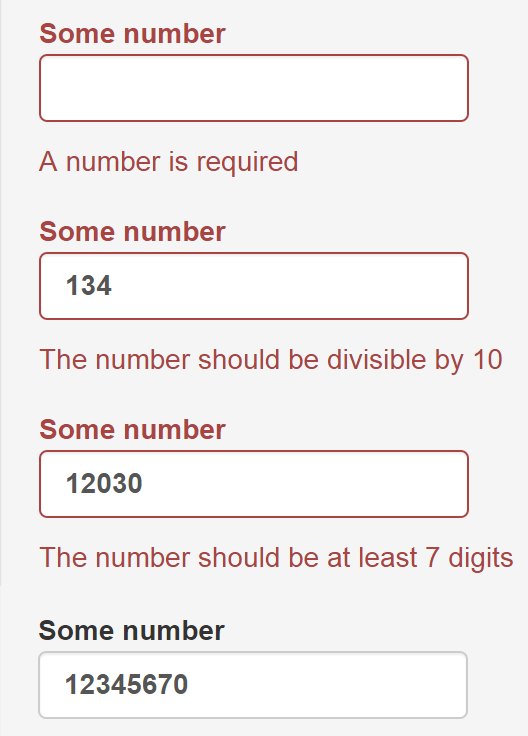
</extended-input>Which should then produce this:
And, while we are at it, why don’t we see just how flexible Angular 2 is, and look at more than one way to do this?
Before we are done, we will have used the following key concepts inside Angular 2:
- Model driven forms
- Form validation and custom validators
- Displaying validation errors
- The @Contentchildren decorator
- Content projection (Angular 2’s own transclusion)
- Component level styling
- Change detection
- Lifecycle hooks
If you are not familiar with these concepts, it may be a good idea to look at them first. The Angular 2 documentation contains information about these points and a number of very good blog articles have been written on all of these topics (see the end of this post for a reference list).
We will use Bootstrap CSS as styling framework. However this can be replaced with your framework of choice.
The three paths
In front of him were three paths. He could choose only one, but the words of the wise woman haunted him and he secretly knew that his journey could only ever become complete if he explored them all.
We will look at three ways to build the same functionality. All three options will use Content Projection as basis.
Then we will look at various ways to manage the display of our error messages.
Preparing for the journey: part 1
Being well prepared was crucial for his journey. He packed quick and light, making sure that he thought of all the necessities.
We need a basis to work from and already know how to create a component in Angular 2 with form validation. So let us build one quickly.
Our component will consist of a form with one input as form element. This input will have a mix of standard and custom validations.
Our component:
@Component({
  selector: 'some-form',
  templateUrl: './some-form.component.html',
  directives: [FORM_DIRECTIVES]
})
export class SomeForm implements OnInit {

  someFormHandle:ControlGroup;
  someNumber:AbstractControl;

  constructor(private formBuilder:FormBuilder) {
  }

  divisibleByTen(control:Control) {
      return parseInt(control.value) % 10 == 0 ? null : {
        divisibleByTen: true
      }
  }

  onSubmit(){
    //Some submit logic
  }

  ngOnInit():void {
    this.someFormHandle = this.formBuilder.group({
      'someNumber': ['', Validators.compose([Validators.required,
                                             Validators.minLength(7),
                                             this.divisibleByTen])]
    });

    this.someNumber = this.someFormHandle.find('someNumber');
  }

}
And our component template:
<form [ngFormModel]="someFormHandle"
      [(ngSubmit)="onSubmit()">

    <input class="form-control"
           [ngFormControl]="someNumber">

    <button class="btn btn-primary"
            [disabled]="!someFormHandle.valid">
            Submit
    </button>

</form>
We now have a component with one input. This input is required, needs a value of at least seven characters/numbers, and the number version of the input value should be divisible by ten.
Preparing for the journey: part 2
Having packed, he strapped on his armour made from Angu-LAHR steel. It was magical armour that shone with colour and power.
We now have an input with some validation attached. But coming face to face with the Monster of UnlabelledInput will make even the most brave warrior tremble, so it really, really needs a label.
NOTE: Web Accessibility (a11y) also really really thinks that an input needs a label, by the way. Omitting well-formed labels for your inputs will really impede some users from using your forms. This article will not focus further on a11y, to avoid making an already complex matter even more so. You will need to do more to make your input fully accessible, but look out for some articles on this in future.
But, back to our label. We could add a label to our input like this:
<label class="control-label">Some number
    <input class="form-control"
           [ngFormControl]="someNumber">
</label>
And this will work perfectly, but why would we want to write this for every single input if we are using something as shiny as Angular 2? Why don’t we use Content Projection to solve this? Well, you could argue that, at this stage, it is not a lot of HTML to write and you would be perfectly right, so lets also add some Bootstrap goodness to style our input and highlight error situations!
And we create a decorator component to add our label and styles:
@Component({
  selector: 'extended-input',
  template: `<div class="form-group"
                  [ngClass]="{'has-error':isError}">
                        <label class="control-label">{{labelText}}
                            <ng-content></ng-content>
                        </label>
             </div>`,
  directives: [CORE_DIRECTIVES]
})
export class ExtendedInput {
  @Input()
  labelText:string = '';
  @Input()
  isError:boolean = false;
}
By using the ng-content element, the HTML contained inside our component’s tags will be projected into this slot inside the component’s template.
Let us use this!
<extended-input [labelText]="'Some number'"
                [isError]="!someNumber.valid">
    <input class="form-control"
           [ngFormControl]="someNumber">
</extended-input>
BAZINGA!!! Now we can decorate any input we want with a label and some magic!
The first path: The children of Angu-LAHR
NOTE: Since this article was written the change detection order in Angular 2 has been adjusted causing this solution to break and sometimes display two messages. It continues to illustrate some interesting concepts in Angular 2, but should not be used as a replacement for ng-messages. Rather use one of the other two options shown later in this article.
He was ready and he stepped onto the burning red sand of the first path. In the distance he could hear voices. For his journey to succeed, he had to talk to them and convince them to give him the magical key.
For this solution we will make use of the @ContentChildren decorator of Angular 2 to access our error messages and switch them on and off.
In order to do this we need to first create a container component for our errors. We will then give it the functionality to add or remove itself to or from the DOM. HEY, we are trying to recreate ng-messages here, after all!
And yes, we are going to use Content Projection in this component too!
@Component({
  selector: 'input-error',
  template: `<span *ngIf="showErrorFlag" class="help-block">
               <ng-content></ng-content>
             </span>`,
  directives: [CORE_DIRECTIVES]
})
export class InputError {

  showErrorFlag:boolean = true;

  hideError():void {
    this.showErrorFlag = false;
  }

  showError():void {
    this.showErrorFlag = true;
  }

}
So now we can extent the HTML of our top level component as follows:
<extended-input [labelText]="'Some number'"
                [isError]="!someNumber.valid">
    <input class="form-control"
           [ngFormControl]="someNumber">
    <input-errors>
        <input-error class="help-block"
                     *ngIf="someNumber.hasError('required')">
            A number is required
        </input-error>
        <input-error class="help-block" *
                     *ngIf="someNumber.hasError('divisibleByTen')">
            The number should be divisible by 10
        </input-error>
        <input-error class="help-block"
                     *ngIf="someNumber.hasError('minlength')">
            The number should be at least 7 digits
        </input-error>
    </input-errors>
</extended-input>
Three important things to note here:
- We are using our new input-error component and projecting the text into its template.
- We have written an input-errors tag in the template. This does NOT refer to another component in our solution. It simply acts as a placeholder. We could have used a div but for this example it is clearer.
- We are using *ngIf to display only the error messages for failed validations.
So now we still need to do two things in our decorator component. Currently it will project all the content right into the label! This is not handy, so we need to project the error messages into another ng-content slot. When that is done we need to remove all but the first displayed error.
And once again Angular 2 comes to our rescue!
We can complete our component:
@Component({
  selector: 'extended-input',
  template: `<div class="form-group"
                  [ngClass]="{'has-error':isError}">
                        <label class="control-label">{{labelText}}
                            <ng-content select="input"></ng-content>
                        </label>
                        <ng-content select="input-errors"></ng-content>
             </div>`,
  directives: [CORE_DIRECTIVES, InputError]
})
export class ExtendedInput implements DoCheck{
  @Input()
  labelText:string = '';
  @Input()
  isError:boolean = false;
  @ContentChildren(InputError)
  errors:QueryList<InputError>;

  ngDoCheck():void {
    if (this.errors) {
      this.errors.toArray().forEach(
        (error:QaInputError, i:number) => {
          if (i == 0) {
            error.showError();
          } else {
            error.hideError();
          }
        });
    }
  }
}
It is important to note how we used @ContentChildren to give us access to the functions on the error component. This makes it a breeze to remove or show error messages.
Two other important things to note:
- Because we are projecting content into more than one slot we need to use CSS selectors to select the content per ng-content slot.
- We need to reset the error messages on each change detection cycle. In this case it is best done using the ngDoCheck lifecycle hook as this is triggered for every cycle.
And here we have our first solution. It works, displaying only the error message with highest priority.
The second path: The wizard of Angu-LAHR
He returned from the first path with the red key. Night had fallen and the second path was bathed in a green glow. He stepped onto the green sand remembering tales from his childhood about a wizard that could make you disappear.
This is the simplest solution we will be looking at. In Angular 2 we can provide component specific CSS. The way the framework renders this into the DOM ensures that the style is only applied to the component and not the rest of the page.
In this case we do not need the extra error component of the previous solution and therefore our base component’s HTML becomes:
<extended-input [labelText]="'Some number'"
                [isError]="!someNumber.valid">
    <input class="form-control"
           [ngFormControl]="someNumber">
    <input-errors>
        <span class="help-block"
              *ngIf="someNumber.hasError('required')">
            A number is required
        </span>
        <span class="help-block" *
              *ngIf="someNumber.hasError('divisibleByTen')">
            The number should be divisible by 10
        </span>
        <span class="help-block"
              *ngIf="someNumber.hasError('minlength')">
            The number should be at least 7 digits
        </span>
    </input-errors>
</extended-input>
Now we simply need to hide all but the first error message using CSS only.
@Component({
  selector: 'extended-input',
  template: `<div class="form-group"
                  [ngClass]="{'has-error':isError}">
                        <label class="control-label">{{labelText}}
                            <ng-content select="input"></ng-content>
                        </label>
                        <ng-content select="input-errors"></ng-content>
             </div>`,
  styles: [`:host input-errors > :not(:first-child) {
                display: none;
            }`]
  directives: [CORE_DIRECTIVES]
})
export class ExtendedInput {
  @Input()
  labelText:string = '';
  @Input()
  isError:boolean = false;
}
And just like that, it is done! It certainly has simplicity in its favour! If anything, the only issue is that some error messages are now removed from the DOM while the rest are hidden with styling.
But a very light-weight solution!
NOTE: In case you have not spotted the :host pseudo-class selector in the CSS, it is very important. If you are trying to apply component styles to projected content you HAVE to use this to indicate that you are planning to style the projected content. Omitting this will apply the styles only to the component’s template. This pseudo-class is a Shadow DOM selector.
The third path: The grail of Angu-LAHR
The sun rose red on the horizon when he returned with a green vial containing a potion of invisibility. Only one path remained. The blue sand shining in the morning sun. At the end of this path was the Grail of Configuration.
Taking some inspiration from ngClass, wouldn’t it be great if we could provide an error definition object to our decorator directive and let it do all the hard work for us?
The answer is a big “YES WE CAN”. But in order to do this, we will need to access the error object of the form element that Angular 2 provides for us automatically.
So now the HTML inside our base component’s template becomes:
<extended-input [labelText]="'Some number'"
                [inputErrors]="someNumber.errors"
                [errorDefs]="{required: 'A number is required',
                              divisibleByTen: 'The number should be divisible by 10',
                              minlength: 'The number should be at least 7 digits'}">
    <input class="form-control"
           [ngFormControl]="someNumber">
</extended-input>
This seems to be a very concise way to write our decorator component inside the HTML. That would be a lot less repeated boilerplating when creating complex forms!
So how can we make this work?
With the following component definition object:
@Component({
  selector: 'extended-input',
  template: `<div class="form-group"
                  [ngClass]="{'has-error':errorMessage}">
                        <label class="control-label">{{labelText}}
                            <ng-content></ng-content>
                        </label>
                        <span class="help-block"
                              *ngIf="errorMessage">
                              {{errorMessage}}
                        </span>
             </div>`,
  directives: [CORE_DIRECTIVES]
})
export class ExtendedInput implements OnChanges {
  @Input()
  labelText:string = '';
  @Input()
  inputErrors:any;
  @Input()
  errorDefs:any;

  errorMessage:string = '';

  ngOnChanges(changes:any):void {
    var errors:any = changes.inputErrors.currentValue;
    this.errorMessage = '';
    if (errors) {
      Object.keys(this.errorDefs).some(key => {
        if (errors[key]) {
          this.errorMessage = this.errorDefs[key];
          return true;
        }
      });
    }
  }
}
After we bind the error object of the input form control to the component, we watch it for changes using the ngOnChanges lifecycle hook. When changes occur, we populate the error placeholder with the first error. Or completely remove it from the DOM if there are no errors.
And with very little code we also get this version of our solution working.
NOTE: Here we use Array.some instead of Array.foreach as it stops iteration when true is returned.
Taking a look back
The old woman looked at the three objects he had crafted on his journey.
“You have done well. Now go back to your village and put what you have found to good use”, said the wise woman.
He knew this was only the start of a great adventure to explore all of Angu-LAHR. He knew that even more powerful items lay within its boundaries.
WOW, Angular 2 rocks.
With minimal code we have created something extremely useful.
But more importantly, this highlights how all the basic pieces you have already know in Angular 2 can be easily put together to build some powerful functionality.
And not only that, but the architecture of Angular 2 gives us a lot of freedom in the options we have to solve problems.
Now go forth, warrior of Angu-LAHR, and find your own treasure!
References
- ViewChildren and ContentChildren in Angular 2 - Minko Gechev
- Styling Angular 2 components - Pascal Precht
- Custom Validators in Angular 2 - Pascal Precht
- Validation for model-driven forms in Angular 2 - Kirils Ladovs
- Transclusion in Angular 2 - Todd Motto