NOTE: This refers to Bootstrap CSS v3
One of the more subtle aspects of Accessibility is the need for good colour contrast when designing your web applications. The Web Content Accessibility Guideline (WCAG) Success Criterion 1.4.3 state the following:
Contrast (Minimum): The visual presentation of text and images of text has a contrast ratio of at least 4.5:1, except for the following: (Level AA)
Large Text: Large-scale text and images of large-scale text have a contrast ratio of at least 3:1.
Incidental: Text or images of text that are part of an inactive user interface component, that are pure decoration, that are not visible to anyone, or that are part of a picture that contains significant other visual content, have no contrast requirement.
Logotypes: Text that is part of a logo or brand name has no minimum contrast requirement.
OK, English please!
Quite simply this means that any text on your website should really display a good contrast with the background it is written on. And translated even more simply: Use a text colour that shows off clearly on the colour of the background.
NOTE: In this article we will concern ourselves with the first point only. The concepts can be easily extended to cater for, or assist in covering all the points.
Why is this so important?
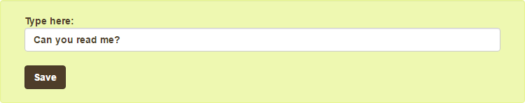
Let’s have a look at the following two options. We’ll start with Good Idea:
Then we present Bad Idea:
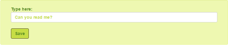
I think that, even before we look at any visual disabilities, we can agree that the first example is easier to look at and read than the second.
Adding to that, many users face difficulties that hamper their vision. Whether it is an actual visual disability, like colour blindness, or simply sitting outside on a sunny day with your smart-phone, text of low contrast can be extremely difficult to read for many users under some conditions.
By using a browser plugin we can simulate a number of these cases.
If ANY person were to look at this website in high glare conditions, how would it look?
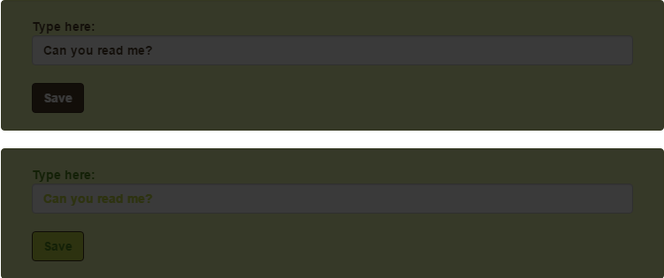
Or what if someone with cataracts visit our crucial website?
In both cases, although both options present difficulties, it becomes quite clear that the first option remains usable, while the second option becomes pretty much useless.
People can only use your websites if they can read and understand them and by taking the effect of colour contrast into account we are opening up doors for far more people to use and enjoy what we have made.
We build our applications for people to use, so if doing this can increase our user base further, there can be only one remaining reason that some may have not to do it. And that is the difficulty of managing this, especially in a complex styling framework like Bootstrap CSS.
The colour contrast implementation challenge.
In the WCAG quote above, we get given the contrast ratios which our colour combinations should conform to. But, as you may have guessed, this involves some mathematical formula that looks at colour luminance. This has been automated, thankfully, and you can find some tools for that at the end of the article. However, even if this is automated, checking all possible colour combinations is a lengthy process.
Then we combine this challenge with using a complex CSS framework like Bootstrap CSS and we can quickly end up with an unmanageable mess.
I have seen the likes of the following in many a project:
  <link rel="stylesheet" href="bootstrap.css">
  <link rel="stylesheet" href="company-style.css">
  <link rel="stylesheet" href="project-style.css">
With this kind of hierarchy it quickly becomes a long-winded process to properly implement the colour-contrast styles we need, or any required style for that matter.
How can we make this easier?
The problem can be made far less challenging by doing two things:
- Pre-calculate your accessible colour combinations.
- Use LESS or SASS to compile all our changes and overrides in to one CSS file.
Pre-calculate an accessible colour combinations matrix.
Even before we start applying colours to our styles, it is a good idea to pre-calculate the accessible colour-pairs (according to the WCAG ratio) from all the colours in our selected colour palette.
So take a set of say, seven colours, and go and calculate the colour contrast between all the other colours in the set and make a list of those that pass. And if we change any colour, go and redo that calculation…
This sounds about as much fun as hitting your head against a wall, it only feels good when you stop.
Wouldn’t it be nice if the computer could do it for us? Well the good news is that there is a great utility called Colorable that we can fetch from npm.
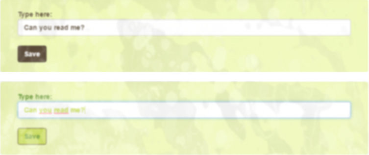
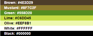
Lets pick a palette. This may or may not be the kind of palette you would select yourself but it was selected as the colours in it can cause some serious accessibility issues if used incorrectly (it is also the palette used in our examples above):
We will now go and calculate all possible colour combinations we can use in this palette that would pass the contrast ratio as defined by WCAG. For simplicity we will only look at the ratio for small text and to pass the AA accessibility level. For more information on the various levels, please consult the WCAG.
So let’s go and fetch Colorable from npm.
npm install colorableWe can now use this package within any npm application. For simplicity we will run the task inside a gulp task. If you do not yet know, gulp is an npm task runner.
If you want to follow along, install gulp.
npm install gulpInside our gulpfile.js we can now define the following code (the same javascript code will work any place where you can run it with npm):
  //Go fetch a reference to the task runner
  var gulp = require("gulp");

  //Go fetch a reference to the colorable module
  var colorable = require("colorable");

  //As we are writing files we need to fetch the file system module
  var fs = require("fs");

  //Define a task for gulp to calculate our colour matrix
  gulp.task("contrast-demo", function () {

      //Our palette
      var colorPalette = {
          Brown: '#4E3D29',
          Mustard: '#8F7C2F',
          Green: '#558D20',
          Lime: '#C6DD45',
          Olive: '#EEF8B1',
          white: '#FFFFFF',
          black: '#000000'
      };

      //Calculate the accessible colours based on a ratio of 4.5:1 as
      //specified by the WCAG. This returns a JSON object with the
      //accessible colour combinations
      var result = colorable(colorPalette, {compact: true, threshold: 4.5});

      //Write the JSON and formatted CSV matrices to files.
      var resultstring = 'Contrast Demo:\r\n';
      resultstring = resultstring + calcColours(result);
      fs.writeFileSync('contrast-demo.json', JSON.stringify(result));
      fs.writeFileSync('contrast-demo.csv', resultstring);

  });

  //Convert the Colorable JSON object to CSV format
  function calcColours(result) {
        var resultstring = '';

        for (var i = 0; i < result.length; i++) {
            resultstring = resultstring +
                           result[i].name +
                           '(' + result[i].hex + ')';
            for (var x = 0; x < result[i].combinations.length; x++) {
                resultstring = resultstring +
                               ',' +
                               result[i].combinations[x].name +
                               '(' + result[i].combinations[x].hex + ')';
            }
            resultstring = resultstring + '\r\n';
        }

        return resultstring;
    }
We then run this with:
gulp contrast-demoColorable directly gives us a result in JSON format, like this:
[
  {
    "hex": "#4E3D29",
    "name": "Brown",
    "combinations": [
      {
        "hex": "#C6DD45",
        "name": "Lime",
        "contrast": 6.834674511212557,
        "accessibility": {
          "aa": true,
          "aaLarge": true,
          "aaa": false,
          "aaaLarge": true
        }
      },
      {
        "hex": "#EEF8B1",
        "name": "Olive",
        "contrast": 9.240254037687162,
        "accessibility": {
          "aa": true,
          "aaLarge": true,
          "aaa": true,
          "aaaLarge": true
        }
      },
      {
        "hex": "#FFFFFF",
        "name": "white",
        "contrast": 10.378279764170347,
        "accessibility": {
          "aa": true,
          "aaLarge": true,
          "aaa": true,
          "aaaLarge": true
        }
      }
    ]
  },
  ...
Each colour in our palette is presented together with all its accessible partners. We can see this even clearer in our CSV file (also created in our gulp task above):
Contrast Demo:
- Brown(#4E3D29), Lime(#C6DD45), Olive(#EEF8B1), white(#FFFFFF)
- Mustard(#8F7C2F), black(#000000)
- Green(#558D20), black(#000000)
- Lime(#C6DD45), Brown(#4E3D29), black(#000000)
- Olive(#EEF8B1), Brown(#4E3D29), black(#000000)
- white(#FFFFFF), Brown(#4E3D29), black(#000000)
- black(#000000), Mustard(#8F7C2F), Green(#558D20), Lime(#C6DD45), Olive(#EEF8B1), white(#FFFFFF)
This starts off with a colour in each line, followed by each colour that could be used as its background.
Once this is set up, it is lightning fast to recalculate the combinations should a colour change or if we are adding or removing colours.
Now we have an accessible palette that can be used as reference to apply the colours to our styles!
Using what we have learnt to customise Bootstrap CSS
Although we can use what we have just learnt in any other styling framework, even those we have created ourselves, we will now look at using it in Bootstrap CSS.
In order to really make this shine you will need to understand either LESS or SASS. As the basic npm install of Bootstrap CSS comes with LESS source files, we will use this, but the concepts can easily be extended to use SASS. NOTE: Bootstrap 4 will come with SASS source.
So without further ado let’s flex our npm muscles again and go fetch Bootstrap with npm:
npm install bootstrapOnce the install is complete we can go to our node_modules folder and look at the Bootstrap folder. It is quite easy to find the LESS source files:
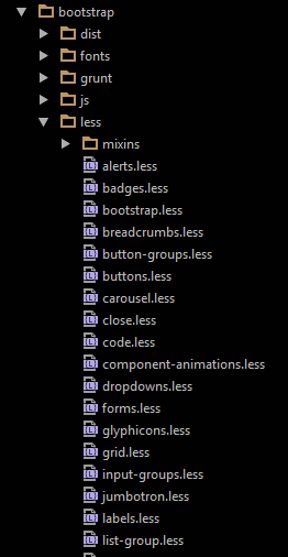
The entry file is bootstrap.less, if we want to have a fully functional Bootstrap CSS file. With this method it is also possible to cherry pick only the components we want to use, like the bootstrap grid system, but that falls outside the scope of this article.
OK, let’s go and define our colour palette in LESS. We create a file and call it palette.less:
@Brown: #4E3D29;
@Mustard: #8F7C2F;
@Green: #558D20;
@Lime: #C6DD45;
@Olive: #EEF8B1;
@white: #FFFFFF;
@black: #000000;
Now we are ready to apply the colours we have defined to Bootstrap CSS in an accessible way.
In order to do this, we need to know the LESS API of Bootstrap. This we can find by looking at the Customise Bootstrap CSS page. Here we find all the variables we can override. We will only override a select few to keep it simple. You can, of course, customise the framework as much or as little as you need to.
Let’s create an override.less file which we will import later. In this file we will override the Bootstrap LESS Variables:
//Import the palette LESS file
@import './palette.less';

//Override the main Bootstrap colour variables.
@gray-base: @Brown;
@gray-darker: @Mustard;
@gray-dark: @Green;
@gray: @Lime;
@gray-light: @Olive;
@gray-lighter: @white;

//Override some container and control colours.
@well-bg: @gray-light;
@input-color: @gray-base;
@text-color: @gray-base;
@btn-primary-color: @gray-lighter;
@btn-primary-bg: @gray-base;
@btn-default-color: @gray-lighter;
@btn-default-bg: @gray-base;
Aside from changing the variables, we can also place overriding CSS styles here. These will be compiled into the resultant CSS. To show this, let’s go and add some button hover and focus styles and set all labels to full width. We just append this to the file we just created:
//Appended to the above overrides.less file.

button.btn {
  font-weight: bolder;
  &:focus,
  &:hover {
    background-color: @gray;
    color: @gray-base;
  }
}

label {
  width: 100%;
}
Cool! Now we are all set! All we need is an entry point file for our own LESS compile that will tie what we have done together with the LESS source files of Bootstrap CSS. Look at the content of a new file we call demo.less:
//Fetch the npm installed bootstrap.less file from your node-modules folder
@import '../node_modules/bootstrap/less/bootstrap.less';
@import './overrides.less';
Note that, in order to override the Bootstrap default values, we have to place the import of our overrides file AFTER the import statement of bootstrap.less
Let’s now go and compile our LESS!
Once again we need something from npm and that is a LESS compiler. And as we are using gulp we do:
npm install gulp-lessNow we are ready for our final gulp task:
gulp.task("contrast-less", function () {
    gulp.src("less/demo.less")
        .pipe(less())
        .pipe(gulp.dest("less/dist"));
});
Let’s run it!
gulp contrast-lessEasy hey?
And when all is said and done our folder structure looks like this:
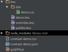
But what is that demo.css file doing there? We did not add it?
This is our compiled CSS file. When we open it, we see it is unmistakably Bootstrap CSS BUT with our colours baked right into its core and our CSS style overrides appended at the end.
This means one stylesheet on your page, no more difficult overrides and extremely simplified maintenance of not only your stylesheets, but of your accessible colour contrasts!
Sounds like a win-win to me…
Some colour contrast tools
It should be a lot clearer now why we need contrast rich interfaces and how to simplify their creation and maintenance, but nothing beats tooling we can use to test out work with. Three tools with super cool colour contrast testing functionality are:
- aXe from Deque.
- Color Contrast Analyzer for Chrome.
- Color Contrast Analyzer application from The Paciello Group